Solutions to WPA6
5. Now it’s your turn
First, download the tdcs.csv datasets from the data
folder on Github and load them in R.
library(tidyverse)

tdcs_data = read_csv('https://raw.githubusercontent.com/laurafontanesi/r-seminar22/master/data/tdcs.csv')
##
## ── Column specification ─────────────────────────────────────────────────────────────────────────────────────────────
## cols(
## RT = col_double(),
## acc_spd = col_character(),
## accuracy = col_double(),
## angle = col_double(),
## block = col_double(),
## coherence = col_double(),
## dataset = col_character(),
## id = col_character(),
## left_right = col_double(),
## subj_idx = col_double(),
## tdcs = col_character(),
## trial_NR = col_double()
## )glimpse(tdcs_data)## Rows: 52,800
## Columns: 12
## $ RT <dbl> 799, 613, 627, 1280, 800, 760, 719, 799, 520, 1066, 480, 627, 467, 560, 867, 733, 759, 600, 706,…
## $ acc_spd <chr> "spd", "spd", "spd", "acc", "spd", "acc", "acc", "spd", "spd", "acc", "spd", "spd", "spd", "spd"…
## $ accuracy <dbl> 1, 1, 1, 0, 1, 1, 0, 0, 1, 1, 1, 1, 1, 0, 1, 1, 1, 1, 1, 1, 1, 1, 1, 1, 1, 0, 1, 0, 1, 1, 1, 1, …
## $ angle <dbl> 180, 180, 180, 180, 180, 180, 180, 180, 180, 180, 180, 180, 180, 180, 180, 180, 180, 180, 180, 1…
## $ block <dbl> 1, 1, 1, 1, 1, 1, 1, 1, 1, 1, 1, 1, 1, 1, 1, 1, 1, 1, 1, 1, 1, 1, 1, 1, 1, 1, 1, 1, 1, 1, 1, 1, …
## $ coherence <dbl> 0.4171, 0.4171, 0.4171, 0.4171, 0.4171, 0.4171, 0.4171, 0.4171, 0.4171, 0.4171, 0.4171, 0.4171, …
## $ dataset <chr> "berkeley", "berkeley", "berkeley", "berkeley", "berkeley", "berkeley", "berkeley", "berkeley", …
## $ id <chr> "S1.1", "S1.1", "S1.1", "S1.1", "S1.1", "S1.1", "S1.1", "S1.1", "S1.1", "S1.1", "S1.1", "S1.1", …
## $ left_right <dbl> 2, 2, 1, 1, 2, 2, 1, 1, 1, 1, 2, 2, 2, 1, 2, 1, 1, 2, 2, 1, 2, 2, 1, 1, 1, 1, 2, 2, 2, 1, 2, 1, …
## $ subj_idx <dbl> 1, 1, 1, 1, 1, 1, 1, 1, 1, 1, 1, 1, 1, 1, 1, 1, 1, 1, 1, 1, 1, 1, 1, 1, 1, 1, 1, 1, 1, 1, 1, 1, …
## $ tdcs <chr> "sham", "sham", "sham", "sham", "sham", "sham", "sham", "sham", "sham", "sham", "sham", "sham", …
## $ trial_NR <dbl> 1, 2, 3, 4, 5, 6, 7, 8, 9, 10, 11, 12, 13, 14, 15, 16, 17, 18, 19, 20, 21, 22, 23, 24, 25, 26, 2…Task A
- Show the distribution of response times (
RT) with a density plot, separately by the accuracy vs. speed conditions (acc_spd) using different colors of the density plots per condition. Be sure to adjust the transparency so that they are both clearly visible and put appropriate axes labels and legend title.
ggplot(data = tdcs_data, mapping = aes(x = RT, fill = acc_spd)) +
    geom_density(alpha = .3) +
    labs(x = 'Response times', fill = 'Condition') +
    scale_fill_discrete(labels = c("accuracy", "speed"))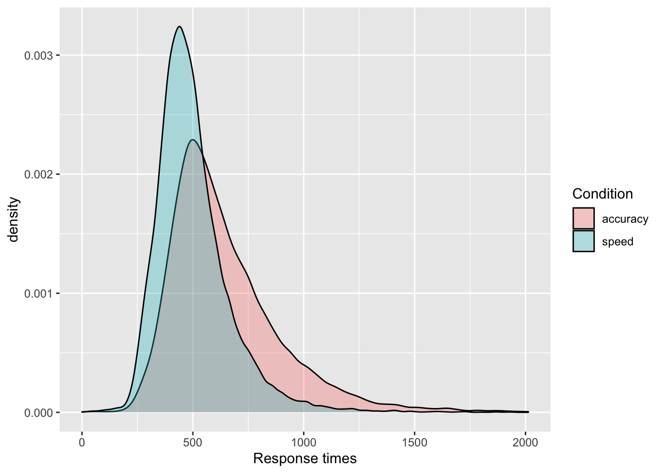
- Show the distribution of response times (
RT) with a histogram, separately by the accuracy vs. speed conditions (acc_spd) using different colors of the density plots per condition. Be sure to adjust the transparency and binwidth, so that they are clearly visible and put appropriate axes labels and legend title. This time, split it furtherly by TDCS manipulation (tdcs) usingfacet_grid().
ggplot(data = tdcs_data, mapping = aes(x = RT, fill = acc_spd)) +
    geom_histogram(binwidth=50, alpha = .3, position="identity") +
    labs(x = 'Response times', fill = 'Condition') +
    facet_grid( ~ tdcs) +
    scale_fill_discrete(labels = c("accuracy", "speed"))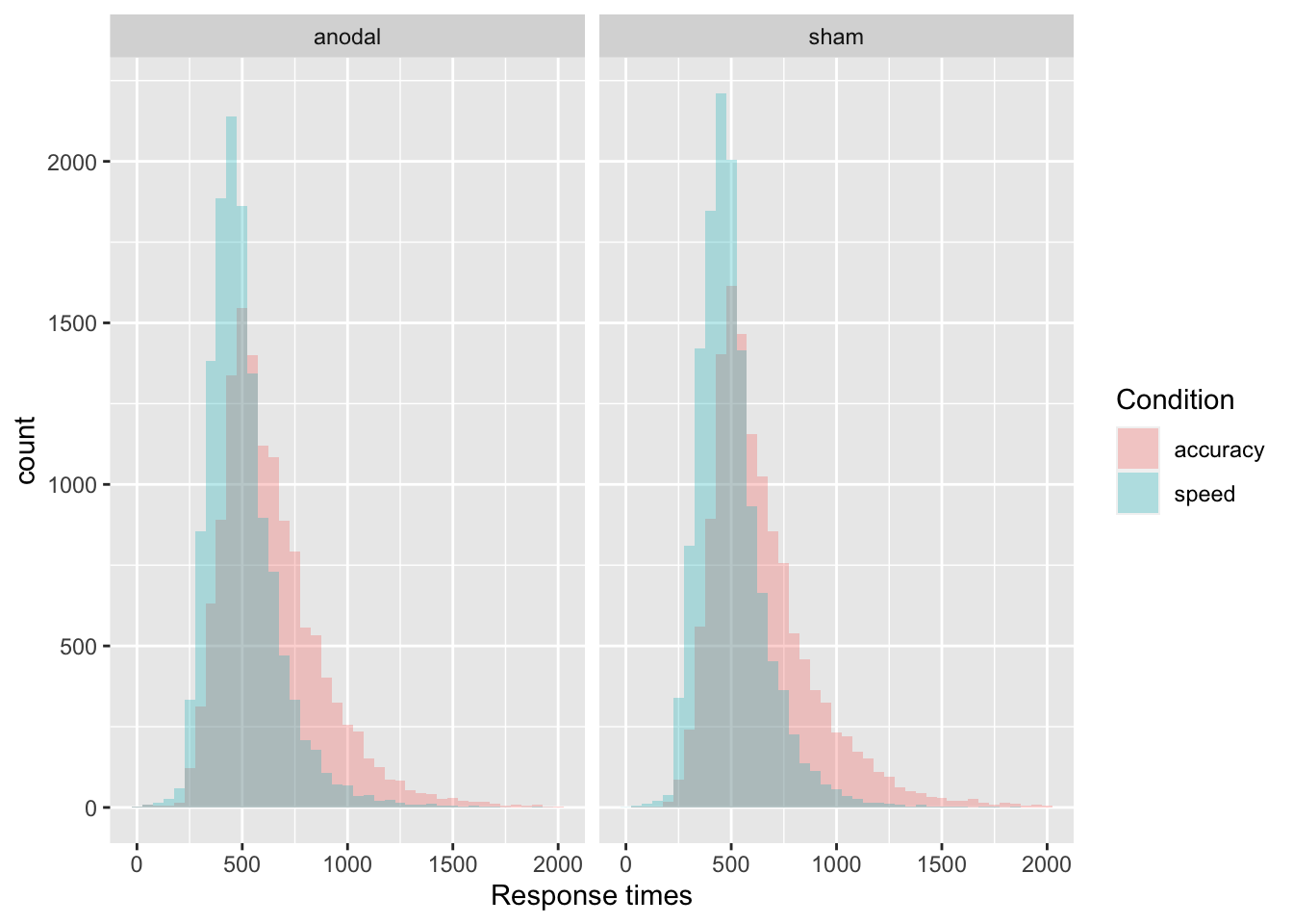
- Show the response times (
RT) with a violinplot, separately by the place the data were collected (dataset). Split further by accuracy vs. speed conditions using colors. Add the 10%, 30%, 50%, 70%, and 90% quantiles, that are the most common in response times data analyses. Change labels appropriately.
ggplot(data = tdcs_data, mapping = aes(x = dataset, y = RT, fill = acc_spd)) +
    geom_violin(draw_quantiles = c(0.1, 0.3, 0.5, 0.7, 0.9)) +
    labs(x = "Place collected", y='RTs')  +
    scale_fill_discrete(name="Condition", labels = c("accuracy", "speed"))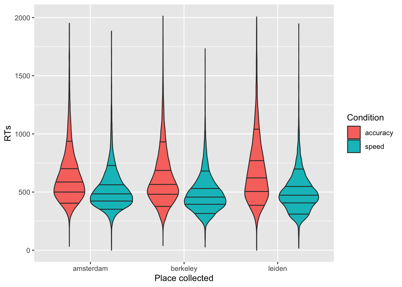
Task B
Now, I am creating a summary of the data, where we look at mean response times and accuracy per subject, separately by coherence (how difficult the task was) and the speed vs. accuracy manipulation:
summary_tdcs_data = summarise(group_by(tdcs_data, id, coherence, acc_spd),
                              mean_RT=mean(RT),
                              mean_accuracy=mean(accuracy))
## `summarise()` has grouped output by 'id', 'coherence'. You can override using the `.groups` argument.glimpse(summary_tdcs_data)## Rows: 176
## Columns: 5
## Groups: id, coherence [88]
## $ id <chr> "A10.1", "A10.1", "A10.2", "A10.2", "A11.1", "A11.1", "A11.2", "A11.2", "A12.1", "A12.1", "A1…
## $ coherence <dbl> 0.4171, 0.4171, 0.4171, 0.4171, 0.4171, 0.4171, 0.4171, 0.4171, 0.1658, 0.1658, 0.1658, 0.165…
## $ acc_spd <chr> "acc", "spd", "acc", "spd", "acc", "spd", "acc", "spd", "acc", "spd", "acc", "spd", "acc", "s…
## $ mean_RT <dbl> 566.1254, 555.3443, 499.8281, 492.7937, 603.8807, 490.6762, 499.9799, 451.5980, 748.8424, 645…
## $ mean_accuracy <dbl> 0.6237288, 0.6327869, 0.6561404, 0.6571429, 0.8771930, 0.8380952, 0.8829431, 0.8239203, 0.517…Using the summarized data:
Plot the relationship between mean response times (
mean_RT) and mean accuracy (mean_accuracy) using a scatterplot.Use
facet_gridto split the plot based on the speed vs. accuracy manipulation (acc_spd).Add the regression lines.
Change with appropriate plot titles and x- and y-axes labels.
Add the coherence levels as color of the dots. Because coherence is a continuous variable and not categorical, you can use
scale_colour_gradientto adjust the gradient.Change the color of the regression lines to grey.
ggplot(data = summary_tdcs_data, mapping = aes(x = mean_RT, y = mean_accuracy, color = coherence)) +
    geom_point(alpha = 0.6, size= 2) +
    geom_smooth(method = lm, color='grey') +
    labs(x='Mean RTs', y='Mean accuracy') +
    ggtitle("Relationship between mean RTs and accuracy") +
    scale_colour_gradient(low = "blue", high = "gold", limits=range(summary_tdcs_data[,'coherence'])) +
    facet_grid( ~ acc_spd)
## `geom_smooth()` using formula 'y ~ x'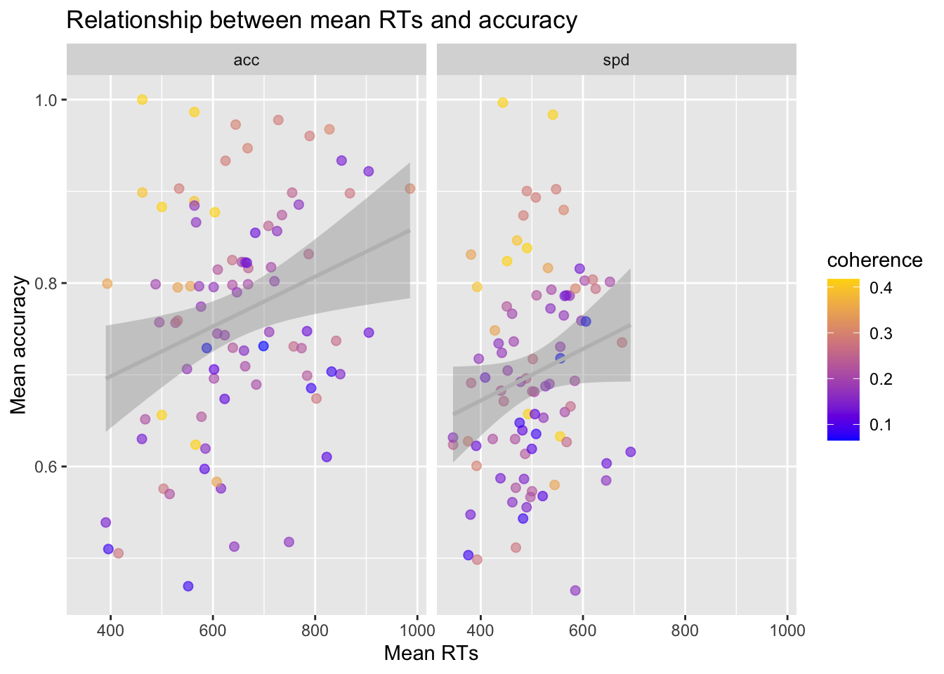
Task C
Using the summarized data:
Plot the mean
mean_accuracy, separately byfactor(coherence)usingstat_summarywith argumentsgeom="bar"andposition = 'dodge'. Split further based on the accuracy vs. speed manipulation (acc_spd) with different colors.Now add error bars representing confidence intervals and using
stat_summaryagain with argumentswidth=.9,position = 'dodge'. Adjust thewidthargument if the error bars are not centered in each of the bars.
ggplot(data = summary_tdcs_data, mapping = aes(x = factor(coherence), y = mean_accuracy, fill=acc_spd)) +
    # stat_summary with arg "fun":

    # A function that returns a single number, in this case the mean worry_cont for each level of cause_recoded:
    stat_summary(fun = "mean", geom="bar", position = 'dodge') +

    # mean_cl_normal( ) is intended for use with stat_summary. It calculates
    # sample mean and lower and upper Gaussian confidence limits based on the
    # t-distribution

    stat_summary(fun.data = mean_cl_normal, geom = "errorbar",  size=.2, width=.9, position = 'dodge') +
    labs(x = 'Coherence level', y = 'Mean accuracy', fill='Condition') +

    # to change the orientation of the x-ticks labels:
    theme(axis.text.x = element_text(angle = 90)) +

    # fix labels in legend
    scale_fill_discrete(labels = c("accuracy", "speed"))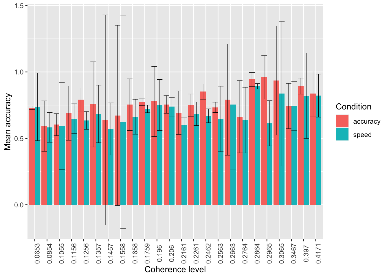
- Do the same again, but:
- using points instead of bars
- standard errors instead of confidence intervals
- mean RTs instead of accuracy
ggplot(data = summary_tdcs_data, mapping = aes(x = factor(coherence), y = mean_RT, color=acc_spd)) +
    # stat_summary with arg "fun":
    # A function that returns a single number, in this case the mean worry_cont for each level of cause_recoded:
    stat_summary(fun = "mean", geom="point") +

    stat_summary(fun.data = mean_se, geom = "errorbar", size=.8, width=.4) +

    labs(x = 'Coherence level', y = 'Mean RTs', color='Condition') +

    # to change the orientation of the x-ticks labels:
    theme(axis.text.x = element_text(angle = 90))  +

    # fix labels in legend
    scale_color_discrete(labels = c("accuracy", "speed"))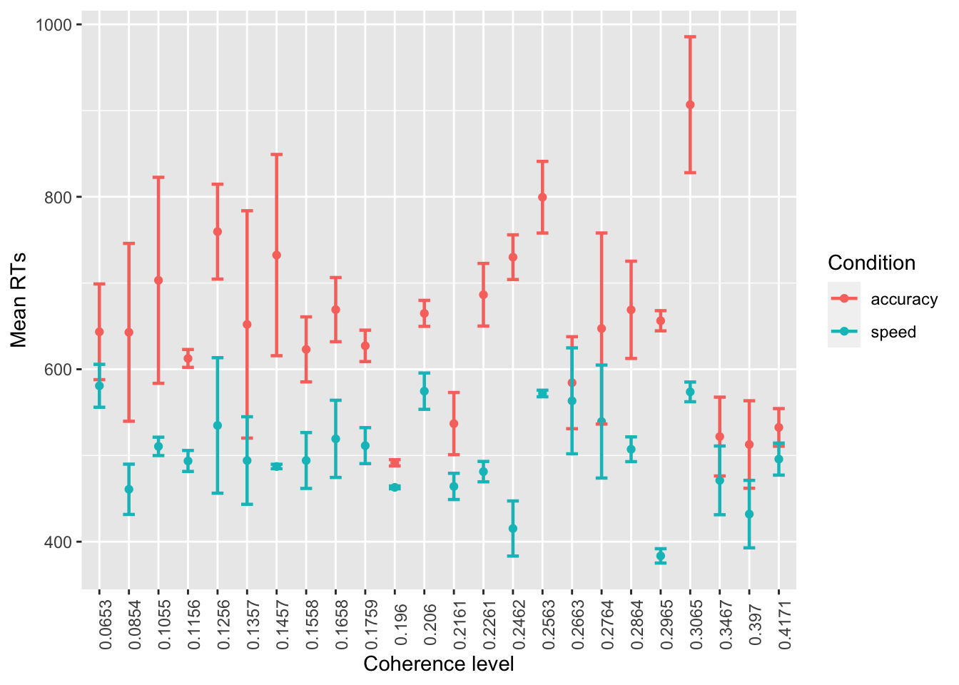
Note that you do not need the
position = 'dodge' here anymore, and that you might have to
adjust size and width of the error bars.