Data visualization
- 1. Basic ggplot2 elements
- 2. Plots with categorical variables
- 3. Plots with
categorical and continuous variables
- 3.1 Box plot showing the distribution of a continuous variable, for each level of a second categorical variable
- 3.1 Box plot showing the distribution of a continuous variable, for each level of a second categorical variable, split by a third categorical variable using facet_grid
- 3.3 Box plot showing the distribution of a continuous variable, for each level of a second categorical variable, split by a third categorical variable using fill
- 3.4 Violin plot showing the distribution of a continuous variable, for each level of a second categorical variable, split by a third categorical variable using the fill
- 3.5 Scatter plot showing the relationship between two continuous variables, split by a third categorical variable with colour, and with regression lines and vertical/horizontal lines showing the means
- 3.6 Histogram showing the distribution of a continuous variable, split by a second categorical variable based on color
- 3.7 Density plot showing the distribution of a continuous variable, split by a second categorical variable based on color
- 4. Adding
error bars
- 4.1 Dot plot showing the mean of a continuous variable across different levels of a categorical variable, with error bars (representing standard error of the mean)
- 4.2 Bar plot showing the mean of a continuous variable across different levels of a categorical variable, with error bars (representing confidence intervals)
- 5. Now it’s your turn
Open RStudio.
Open a new R script in R and save it as
wpa_6_LastFirst.R (where Last and First is your last and
first name).
Careful about: capitalizing, last and first name order, and using
_ instead of -.
At the top of your script, write the following (with appropriate changes):
# Assignment: WPA 3
# Name: Laura Fontanesi
# Date: 19 April 2022
This week, we are going to work with the US survey dataset on public ppinion about climate change (2008-2017).
You can find the original dataset here, and more explanations about the content/coding of the variables.
I selected a few variables and prepared the dataset already, so that you can simply load it in R using the following command:
library(tidyverse)

# Load data in R
survey_data = read_csv("https://raw.githubusercontent.com/laurafontanesi/r-seminar22/master/data/ccam_modified.csv")
##
## ── Column specification ─────────────────────────────────────────────────────────────────────────────────────────────
## cols(
## .default = col_double(),
## cause_recoded = col_character(),
## sci_consensus = col_character(),
## gender = col_character(),
## race = col_character(),
## party_x_ideo = col_character(),
## region4 = col_character(),
## employment = col_character(),
## happening_labels = col_character(),
## age_category_labels = col_character(),
## educ_category_labels = col_character(),
## income_category_labels = col_character()
## )
## ℹ Use `spec()` for the full column specifications.glimpse(survey_data)## Rows: 18,514
## Columns: 30
## $ wave <dbl> 1, 1, 1, 1, 1, 1, 1, 1, 1, 1, 1, 1, 1, 1, 1, 1, 1, 1, 1, 1, 1, 1, 1, 1, 1, 1, 1, 1, …
## $ year <dbl> 2008, 2008, 2008, 2008, 2008, 2008, 2008, 2008, 2008, 2008, 2008, 2008, 2008, 2008, …
## $ happening <dbl> 3, 2, 2, 3, 3, 2, 3, 1, 1, 3, 3, 3, 3, 3, 3, 2, 3, 3, 3, 3, 3, 1, 3, 3, 3, 3, 2, 3, …
## $ cause_recoded <chr> "natural and human", "natural and human", "natural", "natural", "natural and human",…
## $ sci_consensus <chr> "happening", "dont know", "disagreement", "happening", "disagreement", "disagreement…
## $ worry <dbl> 3, 2, 1, 3, 3, 2, 3, 2, 1, 3, 2, 3, 3, 3, 4, 2, 4, 2, 4, 1, 3, 1, 2, 2, 2, 2, 3, 2, …
## $ harm_personally <dbl> 2, 2, 1, 2, 0, 0, 2, 3, 1, 0, 0, 1, 3, 2, 4, 2, 3, 3, 3, 1, 3, 1, 2, 2, 1, 3, 3, 2, …
## $ harm_US <dbl> 3, -1, 1, 2, 0, 0, 3, 3, 1, 0, 0, 0, 3, 2, 4, 2, 3, 3, 3, 1, -1, 1, 2, 2, 2, 4, 4, 3…
## $ harm_dev_countries <dbl> 4, 2, 1, 3, 0, 0, 4, 3, 1, 0, 0, 0, 4, 2, 4, 2, 4, 0, 3, 1, 4, 1, 2, 2, 3, 4, 4, 3, …
## $ harm_future_gen <dbl> 4, 3, 1, 3, 0, 0, 4, 3, 1, 4, 0, 0, 4, 3, 4, 3, 4, 0, 4, 1, 4, 1, 2, 2, 3, 4, 4, 3, …
## $ harm_plants_animals <dbl> 4, 3, 1, 3, 3, 0, 4, 3, 1, 4, 0, 3, 4, 2, 4, 3, 4, 3, 4, 1, 4, 1, 2, 3, 3, 4, 4, 3, …
## $ when_harm_US <dbl> 5, 3, 1, 4, 2, 2, 5, 4, 1, 3, 3, 3, 5, 4, 5, 2, 5, 6, 6, 1, 6, 1, 2, 2, 4, 6, 6, 2, …
## $ reg_CO2_pollutant <dbl> 4, 3, 2, 3, 3, 1, 3, 2, 2, 3, 3, 4, 4, 3, 3, 2, 3, 4, 4, 4, 4, 1, 2, 3, 4, 4, 4, 1, …
## $ reg_utilities <dbl> 4, 3, 1, 4, 1, 1, 2, 2, 2, 4, 3, 1, 4, 3, 2, 2, 3, 1, 4, 4, 3, 1, 4, 3, 4, 4, 1, 3, …
## $ fund_research <dbl> 4, 3, 1, 4, 4, 3, 4, 2, 3, 4, 3, 1, 3, 3, 4, 3, 4, 3, 4, 4, 4, 4, 4, 4, 4, 4, 4, 4, …
## $ discuss_GW <dbl> 3, 2, 1, 2, 1, 2, 3, 2, 3, 3, 2, 2, 2, 1, 3, 2, 2, 1, 3, 1, 4, 1, 2, 2, 2, 2, 1, 3, …
## $ gender <chr> "female", "male", "female", "male", "female", "male", "male", "male", "female", "fem…
## $ age_category <dbl> 3, 2, 2, 3, 1, 1, 1, 1, 2, 3, 3, 3, 3, 3, 3, 1, 2, 3, 2, 2, 2, 3, 2, 1, 3, 1, 3, 3, …
## $ educ_category <dbl> 2, 1, 4, 4, 3, 4, 4, 4, 4, 4, 2, 4, 2, 3, 2, 4, 4, 2, 4, 3, 4, 2, 4, 2, 4, 4, 3, 3, …
## $ income_category <dbl> 2, 1, 1, 3, 2, 2, 1, 2, 3, 3, 1, 1, 3, 1, 1, 3, 3, 1, 1, 2, 3, 1, 2, 2, 1, 2, 1, 3, …
## $ race <chr> "white non hisp", "white non hisp", "hisp", "white non hisp", "white non hisp", "whi…
## $ party_x_ideo <chr> "conservative republican", "no interest", "conservative republican", "conservative r…
## $ region4 <chr> "south", "midwest", "west", "south", "south", "west", "west", "west", "northeast", "…
## $ employment <chr> "Not working –retired", "Not working –disabled", "Not working –looking", "Not workin…
## $ happening_cont <dbl> 3.1770484, 2.3892098, 1.7235311, 4.6690941, 3.3530206, 2.3946275, 2.4170193, 0.55606…
## $ worry_cont <dbl> 2.4890167, 2.5616335, 1.3625589, 2.6617477, 4.2543260, 2.3861420, 2.7739328, 1.48898…
## $ happening_labels <chr> "yes", "dont know", "dont know", "yes", "yes", "dont know", "yes", "no", "no", "yes"…
## $ age_category_labels <chr> "55+", "35-54", "35-54", "55+", "18-34", "18-34", "18-34", "18-34", "35-54", "55+", …
## $ educ_category_labels <chr> "highschool", "no highschool", "bachelor or higher", "bachelor or higher", "college"…
## $ income_category_labels <chr> "50000-99999", "less 50000", "less 50000", "more 100000", "50000-99999", "50000-9999…1. Basic ggplot2 elements
In this course, we are going to use ggplot2 for
plotting. You find the full ggplot2 refererence here.
Every ggplot2 graphic has three essential
components:
data: the dataset containing the variables of interest.geom: the geometric object in question. This refers to the type of object we can observe in a plot. For example: points, lines, and bars.mapping: aesthetic attributes of the geometric object. They decide which variables of the dataset are shown and in which position. For example, the variables on the x- and y-axes, the variables that give the color or the size to specific elements.
The basic template for a plot is:
ggplot(data = <DATA>, mapping = aes(<MAPPINGS>)) +
  <GEOM_FUNCTION>()
Where you would:
- call your dataframe instead of
<DATA> - specify the main variables and their position instead of
<MAPPINGS> - specify the type of plot insead of
<GEOM_FUNCTION>
Note the + notation at the end of the first line. That
is to tell ggplot2 that you are still adding/changing
components to/of the same plot. So, if you want to add/change other
components, you would also put a + at the end of the second
line and add a new function in the third line.
In the course introduction we had for example:
ggplot(data = movies, mapping = aes(x = best_pic_nom, y = audience_score, fill = best_dir_win)) +
  geom_boxplot() +
  labs(x = "Movie Was Nominated For A Best Picture Oscar", y = "Audience Score", fill = "Director won oscar") +
ggtitle("Relationship Between Audience Score, Movie Picture Oscar and Director Achievement")movieswas the name of our dataframebest_pic_nomwas the variable to show on the x-axis,audience_scoreon the y-axis, andbest_dir_winas a colorgeom_boxplot()was the kind of plot (as boxplot in that case)labs()was to change the lables of the x- and y-axes, and of the color-legendggtitle()was to change the title of the plot
So in this case labs() and ggtitle() were
additional functions to add/change components to our plot.
1.1 Aesthetic attributes
Their function depends on the specific plot (see below). But the main arguments are:
x: the variable on the x-axisy: the variable on the y-axiscolor/fill: the variable that determines the color to the plots’ elementssize: the variable that determines the size to the plots’ elementsshape: the variable that determines the shape of the plots’ elements
1.2 Geometric objects
We use:
Bar plots:
geom_bar()to plot one value for each level of a categorical variablex(you can also split each level according to the levels of a second categorical variable using thefillaesthetic argument). Typically, these values are frequencies (how many observations are there per level?) or means (in this case you should compute the mean of a second variableyfor each level of the categorical variablexbefore plotting).Box and violin plots:
geom_boxplot()orgeom_violin()to plot the the distribution of a continuous variableyfor different levels of a categorical variablex(you can also add a third categorical variable using thefillaesthetic argument).Histograms and density plots:
geom_histogram()orgeom_density()to plot the the distribution of a continuous variablex(you can also plot separate distributions based on a second categorical variable using thefillaesthetic argument).Scatter plots:
geom_point()to plot the relationship between 2 continuous variables. You can add a third variable (either continuous or categorical) using thecoloraesthetic argument. In case the third variable is continuous, we can also add thescale_colour_gradientfunction, to change the colour gradient. You can also choose to show the third variable as the size of the points instead of the colour using thesizeaesthetic argument. You could then show a maximum of 4 variables: 1 on the x-axis, one on the y-axis, one as colour, and one as size of the dots.Lines:
geom_abline(),geom_hline(),geom_vline(),geom_line()andgeom_smooth()to plot lines (typically to show the mean of a distribution, or a regression line in a scatter plot).Error bars:
geom_errorbar()to add error bars (typically to bar plots or to line plots).
1.3 Additional functions
facet_grid()andfacet_wrap(): to split a plot into several plots by the values of another variable.scale_colour_gradient(): to adjust the color gradient, when the color variable is continuous.ggsave(): to save the plot to file.labs(): to change the lables of the x- and y-axes, and of the color-legend.ggtitle(): to change the title of the plot.
1.4 Additional arguments to functions
Note that each function can take additional arguments. In the example
above, the labs() function took the additional
x, y and fill arguments to
specify which label corresponded to which variable.
2. Plots with categorical variables
2.1 Bar plot showing frequencies of a categorical variable, split by a second categorical variable
Note here what happens when you write x = year instead
of x = factor(year). The point is that ggplot
might not understand that year is a categorical variable
(see in the dataframe summery above). So, to make sure
ggplot treats certain variables as categorical, you can sue
the factor() function.
ggplot(data = survey_data, mapping = aes(x = factor(year), fill = age_category_labels)) +
    geom_bar() +
    labs(x="Year", fill="Age")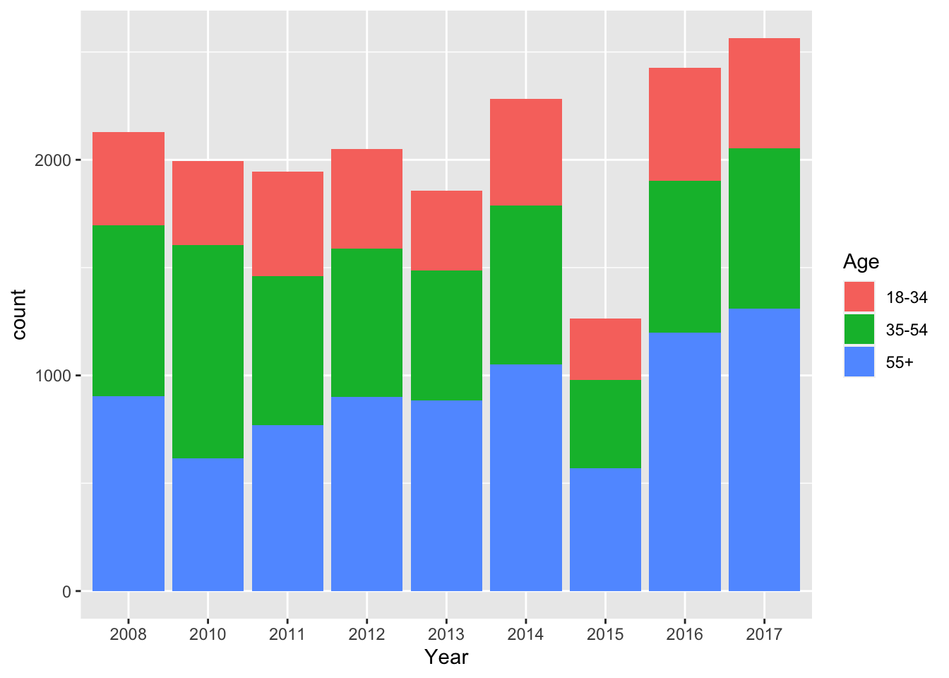
ggplot(data = survey_data, mapping = aes(x = income_category_labels, fill=gender)) +
    geom_bar(position = "dodge") +
    labs(x = "Income category", fill="Gender")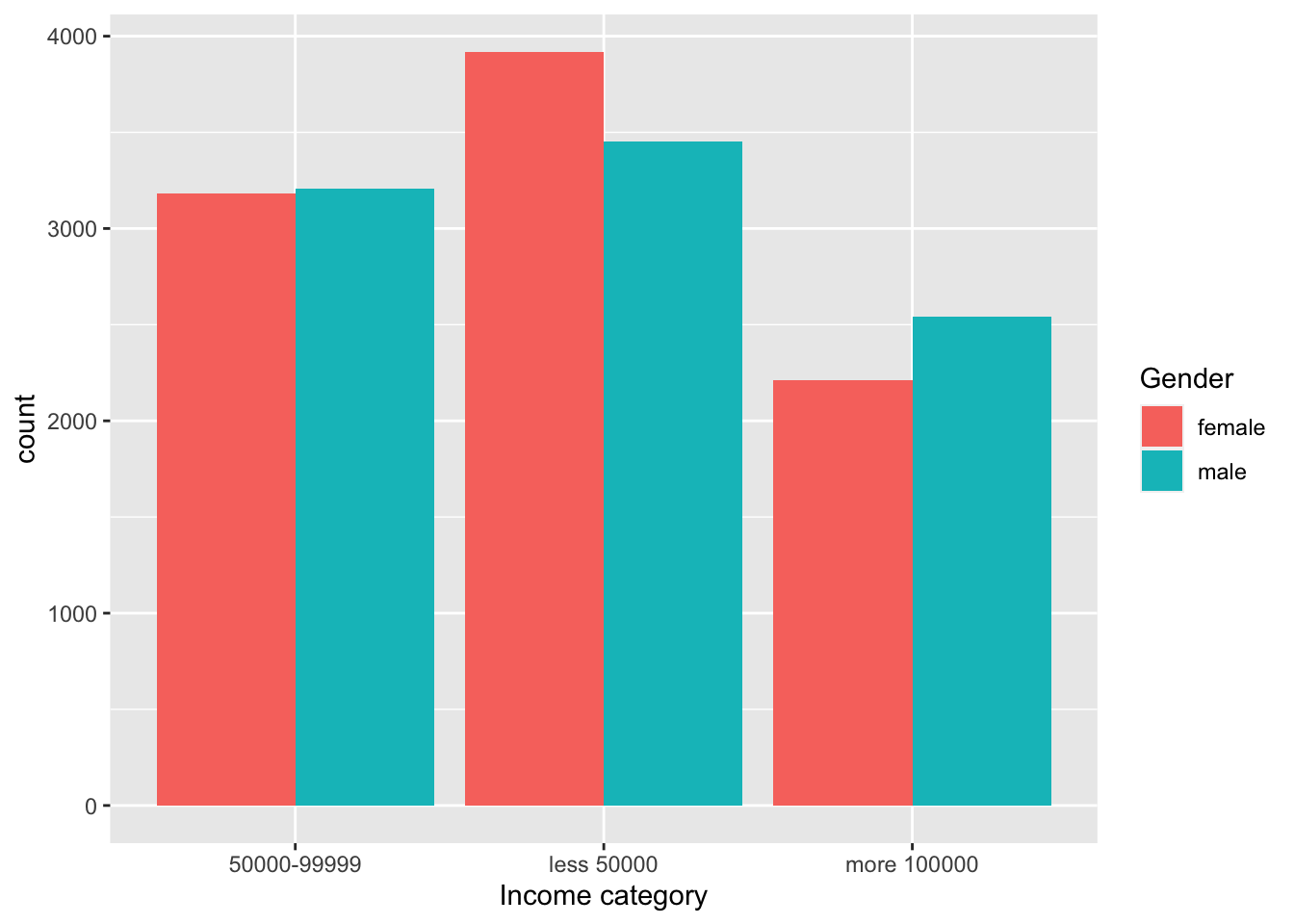
3. Plots with categorical and continuous variables
3.1 Box plot showing the distribution of a continuous variable, for each level of a second categorical variable
ggplot(data = survey_data, mapping = aes(x = factor(harm_future_gen), y = happening_cont)) +
    geom_boxplot() +
    labs(x = "Will GW harm future generations?", y='Is GW happening?')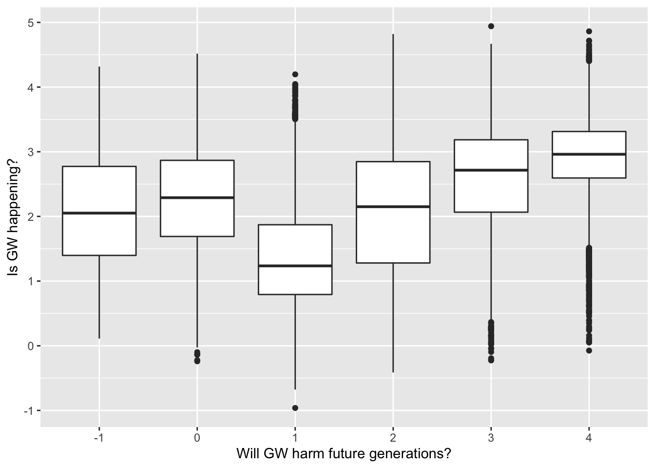
3.1 Box plot showing the distribution of a continuous variable, for each level of a second categorical variable, split by a third categorical variable using facet_grid
ggplot(data = survey_data, mapping = aes(x = happening_labels, y = worry_cont)) +
    geom_boxplot() +
    facet_grid(~ gender)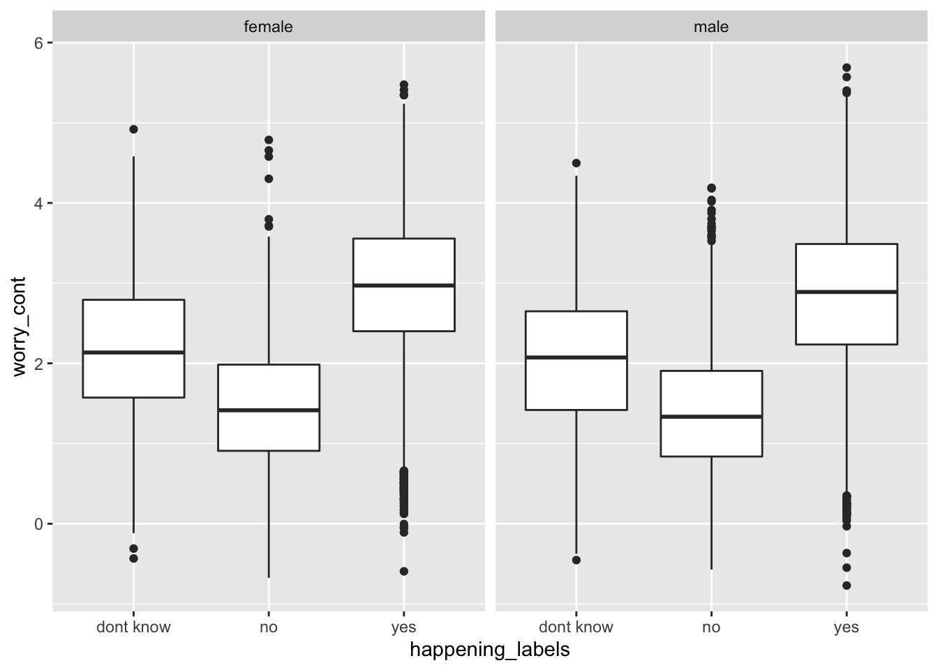
3.3 Box plot showing the distribution of a continuous variable, for each level of a second categorical variable, split by a third categorical variable using fill
ggplot(data = survey_data, mapping = aes(x = happening_labels, y = worry_cont, fill = gender)) +
    geom_boxplot()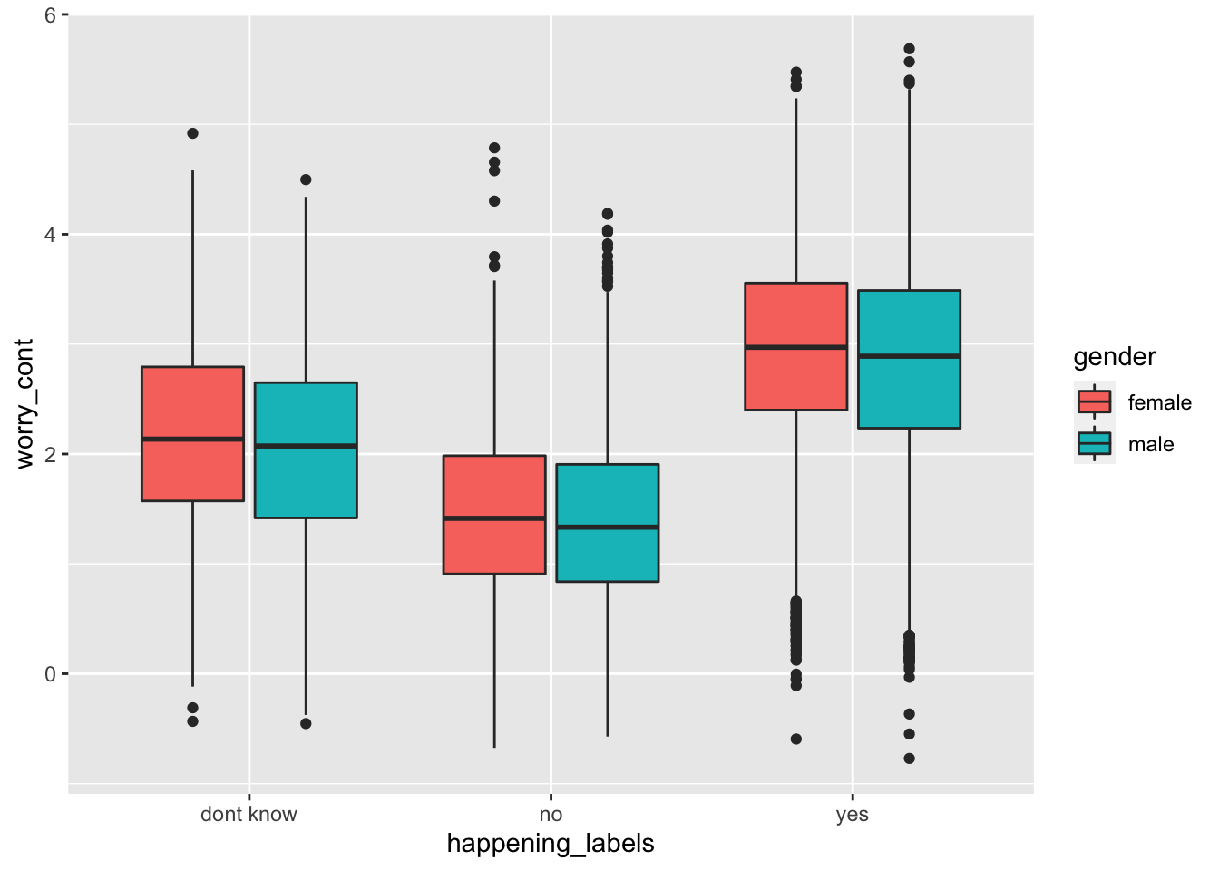
3.4 Violin plot showing the distribution of a continuous variable, for each level of a second categorical variable, split by a third categorical variable using the fill
ggplot(data = survey_data, mapping = aes(x = party_x_ideo, y = worry_cont)) +
    geom_violin(draw_quantiles = c(0.25, 0.5, 0.75)) +
    labs(x = "Party/ideology", y='How worried of GW are you?')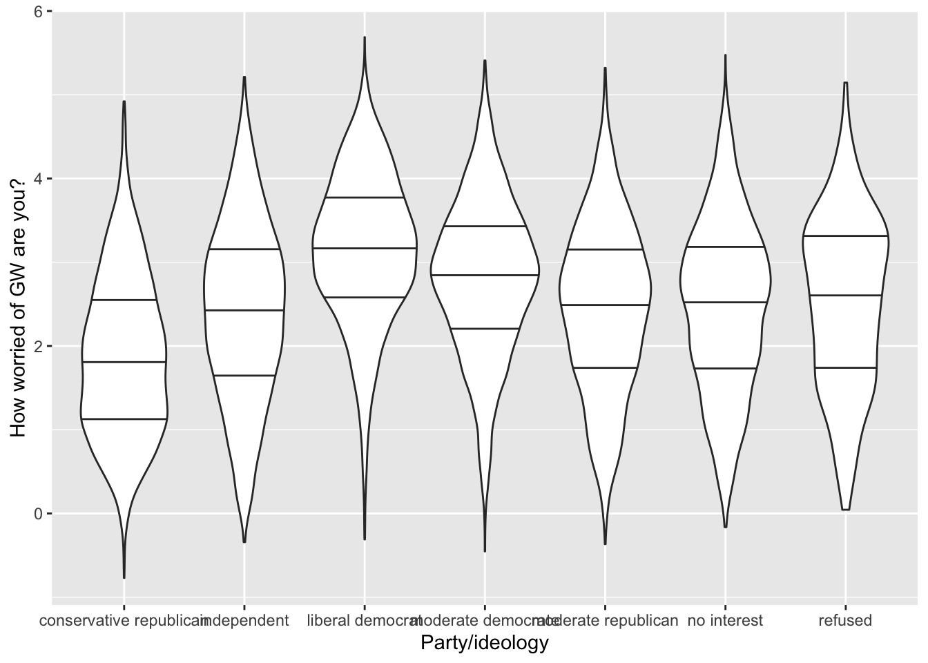
3.5 Scatter plot showing the relationship between two continuous variables, split by a third categorical variable with colour, and with regression lines and vertical/horizontal lines showing the means
ggplot(data = survey_data, mapping = aes(x = happening_cont, y = worry_cont, shape=gender, color=gender)) +
    geom_point(alpha = .3, size= 1) +
    geom_vline(xintercept = mean(survey_data$happening_cont), linetype="dotted") +
    geom_hline(yintercept = mean(survey_data$worry_cont), linetype="dotted") +
    geom_smooth(method = lm) +
    labs(x='Is GW happening?', y='How worried of GW are you?') +
    ggtitle("Relationship between GW believe and anxiety, by gender")
## `geom_smooth()` using formula 'y ~ x'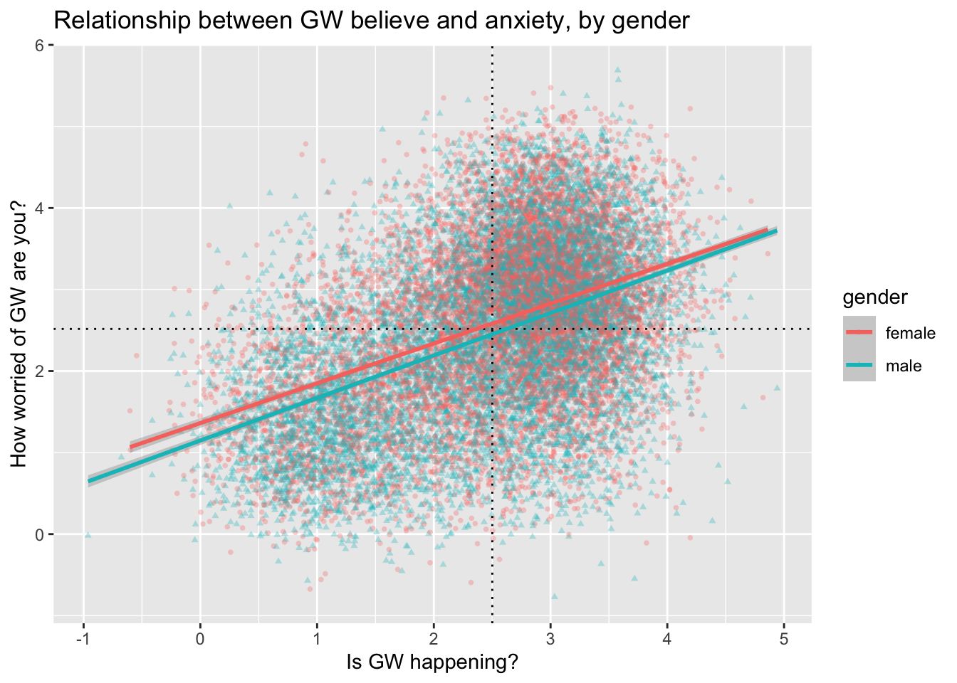
3.6 Histogram showing the distribution of a continuous variable, split by a second categorical variable based on color
ggplot(data = survey_data, mapping = aes(x = happening_cont, fill = sci_consensus)) +
    geom_histogram(binwidth=.1, alpha = .4, position="identity") +
    labs(x = 'Is GW happening?', fill = 'What is the scientific consensus on GW?')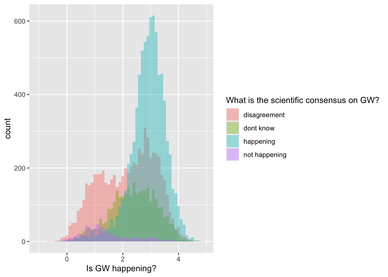
3.7 Density plot showing the distribution of a continuous variable, split by a second categorical variable based on color
ggplot(data = survey_data, mapping = aes(x = worry_cont, fill = cause_recoded)) +
    geom_density(alpha = .2) +
    labs(x = 'How worried of GW are you?', fill = 'What is causing GW?')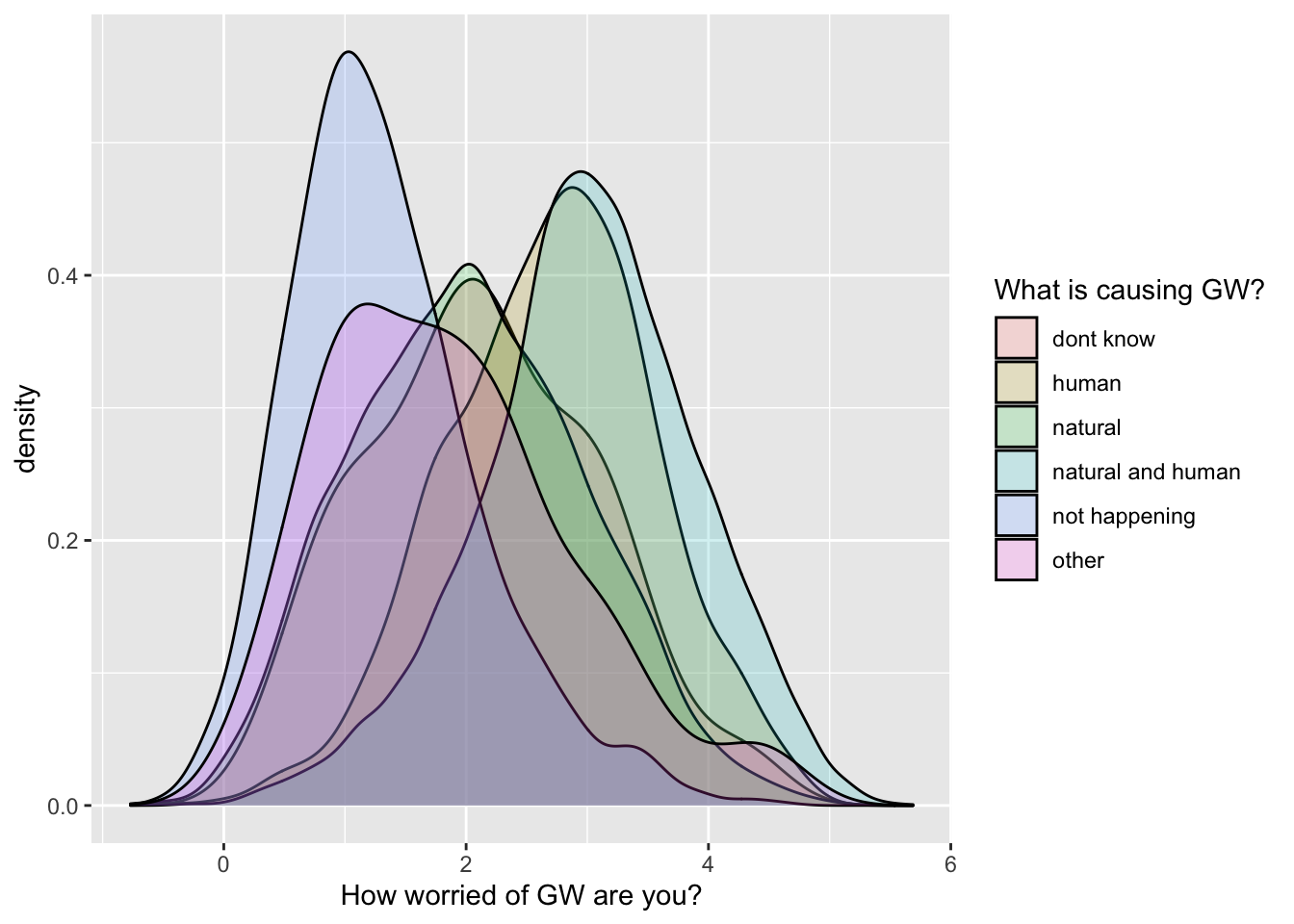
It’s a bit crowded… so I will filter the dataset to exclude a few
levels of the cause_recoded variable:
filtered_survey_data = filter(survey_data,
                              cause_recoded != "dont know",
                              cause_recoded != "other")

ggplot(data = filtered_survey_data, mapping = aes(x = worry_cont, fill = cause_recoded)) +
    geom_density(alpha = .2) +
    labs(x = 'How worried of GW are you?', fill = 'What is causing GW?')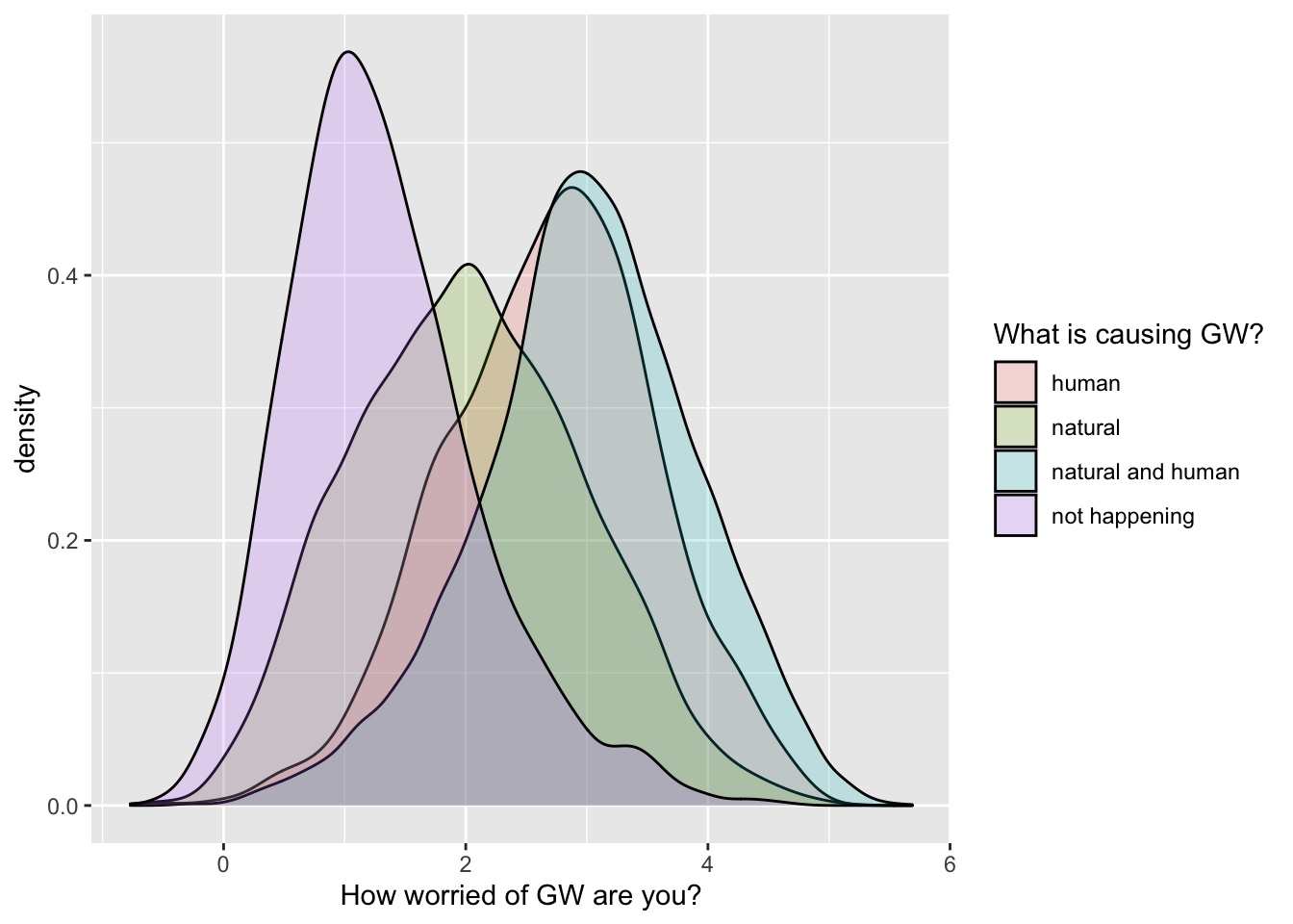
4. Adding error bars
4.1 Dot plot showing the mean of a continuous variable across different levels of a categorical variable, with error bars (representing standard error of the mean)
ggplot(data = filtered_survey_data, mapping = aes(x = educ_category_labels, y = worry_cont)) +
    # stat_summary with arg "fun":
    # A function that returns a single number, in this case the mean worry_cont for each level of educ_category_labels:
    stat_summary(fun = "mean", geom = "point", size = 6) +

    # mean_se( ) is intended for use with stat_summary. It calculates mean and
    # standard error
    stat_summary(fun.data = mean_se, geom = "errorbar", size=1.5, width=.1) +

    labs(x = 'Education level', y = 'How worried of GW are you?')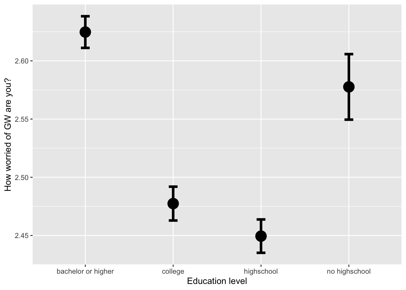
4.2 Bar plot showing the mean of a continuous variable across different levels of a categorical variable, with error bars (representing confidence intervals)
ggplot(data = filtered_survey_data, mapping = aes(x = race, y = worry_cont)) +
    # stat_summary with arg "fun.y":
    # A function that returns a single number, in this case the mean worry_cont for each level of cause_recoded:
    stat_summary(fun = "mean", geom="bar") +

    # mean_cl_normal( ) is intended for use with stat_summary. It calculates
    # sample mean and lower and upper Gaussian confidence limits based on the
    # t-distribution
    stat_summary(fun.data = mean_cl_normal, geom = "errorbar", size=1, width=.3) +

    labs(x = 'Ethnic group', y = 'How worried of GW are you?')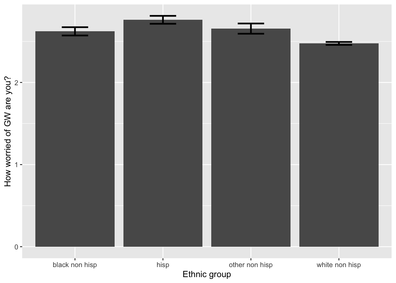
5. Now it’s your turn
First, download the tdcs.csv datasets from the data
folder on Github and load them in R.
Task A
Show the distribution of response times (
RT) with a density plot, separately by the accuracy vs. speed conditions (acc_spd) using different colors of the density plots per condition. Be sure to adjust the transparency so that they are both clearly visible and put appropriate axes labels and legend title.Show the distribution of response times (
RT) with a histogram, separately by the accuracy vs. speed conditions (acc_spd) using different colors of the density plots per condition. Be sure to adjust the transparency and binwidth, so that they are clearly visible and put appropriate axes labels and legend title. This time, split it furtherly by TDCS manipulation (tdcs) usingfacet_grid().Show the response times (
RT) with a violinplot, separately by the place the data were collected (dataset). Split further by accuracy vs. speed conditions using colors. Add the 10%, 30%, 50%, 70%, and 90% quantiles, that are the most common in response times data analyses. Change labels appropriately.
Task B
Now, I am creating a summary of the data, where we look at mean response times and accuracy per subject, separately by coherence (how difficult the task was) and the speed vs. accuracy manipulation:
summary_tdcs_data = summarise(group_by(tdcs_data, id, coherence, acc_spd),
                              mean_RT=mean(RT),
                              mean_accuracy=mean(accuracy))

glimpse(summary_tdcs_data)
Using the summarized data:
Plot the relationship between mean response times (
mean_RT) and mean accuracy (mean_accuracy) using a scatterplot.Use
facet_gridto split the plot based on the speed vs. accuracy manipulation (acc_spd).Add the regression lines.
Change with appropriate plot titles and x- and y-axes labels.
Add the coherence levels as color of the dots. Because coherence is a continuous variable and not categorical, you can use
scale_colour_gradientto adjust the gradient.Change the color of the regression lines to grey.
Task C
Using the summarized data:
Plot the mean
mean_accuracy, separately byfactor(coherence)usingstat_summarywith argumentsgeom="bar"andposition = 'dodge'. Split further based on the accuracy vs. speed manipulation (acc_spd) with different colors.Now add error bars representing confidence intervals and using
stat_summaryagain with argumentswidth=.9,position = 'dodge'. Adjust thewidthargument if the error bars are not centered in each of the bars.Do the same again, but:
- using points instead of bars
- standard errors instead of confidence intervals
- mean RTs instead of accuracy
Note that you do not need the
position = 'dodge' here anymore, and that you might have to
adjust size and width of the error bars.
Submit your assignment
Save and email your script to me at laura.fontanesi@unibas.ch by the end of Friday.