Tidying data
Open RStudio.
Open a new R script in R and save it as
wpa_5_LastFirst.R (where Last and First is your last and
first name).
Careful about: capitalizing, last and first name order, and using
_ instead of -.
At the top of your script, write the following (with appropriate changes):
# Assignment: WPA 5
# Name: Laura Fontanesi
# Date: 12 April 2022
1. Definition of tidy data
In tidy data: - Each variable forms a column. - Each observation forms a row.
This means that data in wide format are not tidy.
Funtions to transform dataset:
pivot_longer()(https://tidyr.tidyverse.org/reference/pivot_longer.html)pivot_wider()(https://tidyr.tidyverse.org/reference/pivot_wider.html)
2. Some examples
We can install the fivethirtyeight which contains many datasets to practice tidying data.
library(tidyverse)

#install.packages('fivethirtyeight')
library(fivethirtyeight)
Pulitzer dataset
head(pulitzer)## # A tibble: 6 x 7
## newspaper circ2004 circ2013 pctchg_circ num_finals1990_2003 num_finals2004_2014 num_finals1990_2014
## <chr> <dbl> <dbl> <int> <int> <int> <int>
## 1 USA Today 2192098 1674306 -24 1 1 2
## 2 Wall Street Journal 2101017 2378827 13 30 20 50
## 3 New York Times 1119027 1865318 67 55 62 117
## 4 Los Angeles Times 983727 653868 -34 44 41 85
## 5 Washington Post 760034 474767 -38 52 48 100
## 6 New York Daily News 712671 516165 -28 4 2 6Here is the article connected to this dataset: https://fivethirtyeight.com/features/do-pulitzers-help-newspapers-keep-readers/
This format might be good if you are interested in analysing the
pctchg_circ variable, which summarizes the percentage
change in daily circulation numbers from the year 2004 to the year
2013.
But what if you want to look at the daily circulations? These are two observations done in two different years. Therefore, the data in this format are not tidy.
To make it more tidy, we should pivot the dataset to a longer format:
pulitzer_new = pulitzer %>%
    pivot_longer(cols = starts_with("circ"), # circ2004:circ2013
                 names_to = "year_circulation",
                 names_prefix = "circ", # not necessary in this case, but better to add
                 values_to = "daily_circulations") %>%
    arrange(year_circulation) # not necessary, but for easier reading/checking

print(dim(pulitzer))
## [1] 50 7print(dim(pulitzer_new))## [1] 100 7head(pulitzer_new)## # A tibble: 6 x 7
## newspaper pctchg_circ num_finals1990_… num_finals2004_… num_finals1990_… year_circulation daily_circulati…
## <chr> <int> <int> <int> <int> <chr> <dbl>
## 1 USA Today -24 1 1 2 2004 2192098
## 2 Wall Street Journal 13 30 20 50 2004 2101017
## 3 New York Times 67 55 62 117 2004 1119027
## 4 Los Angeles Times -34 44 41 85 2004 983727
## 5 Washington Post -38 52 48 100 2004 760034
## 6 New York Daily News -28 4 2 6 2004 712671To visualize, we can plot the daily circulation numbers, divided by year and across the different newspapers:
ggplot(data = pulitzer_new, mapping = aes(x = reorder(newspaper, daily_circulations), y = daily_circulations, fill = factor(year_circulation))) +
    geom_col(position='dodge') +
    labs(x = 'Newspaper', y = 'Daily circulations', fill='Year') +
    theme(axis.text.x = element_text(angle = 90))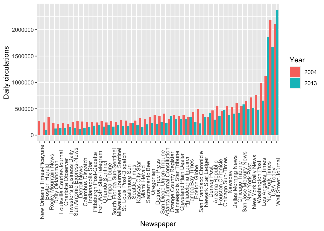
Drug use dataset
glimpse(drug_use)## Rows: 17
## Columns: 28
## $ age <ord> 12, 13, 14, 15, 16, 17, 18, 19, 20, 21, 22-23, 24-25, 26-29, 30-34, 35-49, 50-64, 65+
## $ n <int> 2798, 2757, 2792, 2956, 3058, 3038, 2469, 2223, 2271, 2354, 4707, 4591, 2628, 2864, 7391…
## $ alcohol_use <dbl> 3.9, 8.5, 18.1, 29.2, 40.1, 49.3, 58.7, 64.6, 69.7, 83.2, 84.2, 83.1, 80.7, 77.5, 75.0, …
## $ alcohol_freq <dbl> 3, 6, 5, 6, 10, 13, 24, 36, 48, 52, 52, 52, 52, 52, 52, 52, 52
## $ marijuana_use <dbl> 1.1, 3.4, 8.7, 14.5, 22.5, 28.0, 33.7, 33.4, 34.0, 33.0, 28.4, 24.9, 20.8, 16.4, 10.4, 7…
## $ marijuana_freq <dbl> 4, 15, 24, 25, 30, 36, 52, 60, 60, 52, 52, 60, 52, 72, 48, 52, 36
## $ cocaine_use <dbl> 0.1, 0.1, 0.1, 0.5, 1.0, 2.0, 3.2, 4.1, 4.9, 4.8, 4.5, 4.0, 3.2, 2.1, 1.5, 0.9, 0.0
## $ cocaine_freq <dbl> 5.0, 1.0, 5.5, 4.0, 7.0, 5.0, 5.0, 5.5, 8.0, 5.0, 5.0, 6.0, 5.0, 8.0, 15.0, 36.0, NA
## $ crack_use <dbl> 0.0, 0.0, 0.0, 0.1, 0.0, 0.1, 0.4, 0.5, 0.6, 0.5, 0.5, 0.5, 0.4, 0.5, 0.5, 0.4, 0.0
## $ crack_freq <dbl> NA, 3.0, NA, 9.5, 1.0, 21.0, 10.0, 2.0, 5.0, 17.0, 5.0, 6.0, 6.0, 15.0, 48.0, 62.0, NA
## $ heroin_use <dbl> 0.1, 0.0, 0.1, 0.2, 0.1, 0.1, 0.4, 0.5, 0.9, 0.6, 1.1, 0.7, 0.6, 0.4, 0.1, 0.1, 0.0
## $ heroin_freq <dbl> 35.5, NA, 2.0, 1.0, 66.5, 64.0, 46.0, 180.0, 45.0, 30.0, 57.5, 88.0, 50.0, 66.0, 280.0, …
## $ hallucinogen_use <dbl> 0.2, 0.6, 1.6, 2.1, 3.4, 4.8, 7.0, 8.6, 7.4, 6.3, 5.2, 4.5, 3.2, 1.8, 0.6, 0.3, 0.1
## $ hallucinogen_freq <dbl> 52, 6, 3, 4, 3, 3, 4, 3, 2, 4, 3, 2, 3, 2, 3, 44, 2
## $ inhalant_use <dbl> 1.6, 2.5, 2.6, 2.5, 3.0, 2.0, 1.8, 1.4, 1.5, 1.4, 1.0, 0.8, 0.6, 0.4, 0.3, 0.2, 0.0
## $ inhalant_freq <dbl> 19.0, 12.0, 5.0, 5.5, 3.0, 4.0, 4.0, 3.0, 4.0, 2.0, 4.0, 2.0, 4.0, 3.5, 10.0, 13.5, NA
## $ pain_releiver_use <dbl> 2.0, 2.4, 3.9, 5.5, 6.2, 8.5, 9.2, 9.4, 10.0, 9.0, 10.0, 9.0, 8.3, 5.9, 4.2, 2.5, 0.6
## $ pain_releiver_freq <dbl> 36, 14, 12, 10, 7, 9, 12, 12, 10, 15, 15, 15, 13, 22, 12, 12, 24
## $ oxycontin_use <dbl> 0.1, 0.1, 0.4, 0.8, 1.1, 1.4, 1.7, 1.5, 1.7, 1.3, 1.7, 1.3, 1.2, 0.9, 0.3, 0.4, 0.0
## $ oxycontin_freq <dbl> 24.5, 41.0, 4.5, 3.0, 4.0, 6.0, 7.0, 7.5, 12.0, 13.5, 17.5, 20.0, 13.5, 46.0, 12.0, 5.0,…
## $ tranquilizer_use <dbl> 0.2, 0.3, 0.9, 2.0, 2.4, 3.5, 4.9, 4.2, 5.4, 3.9, 4.4, 4.3, 4.2, 3.6, 1.9, 1.4, 0.2
## $ tranquilizer_freq <dbl> 52.0, 25.5, 5.0, 4.5, 11.0, 7.0, 12.0, 4.5, 10.0, 7.0, 12.0, 10.0, 10.0, 8.0, 6.0, 10.0,…
## $ stimulant_use <dbl> 0.2, 0.3, 0.8, 1.5, 1.8, 2.8, 3.0, 3.3, 4.0, 4.1, 3.6, 2.6, 2.3, 1.4, 0.6, 0.3, 0.0
## $ stimulant_freq <dbl> 2.0, 4.0, 12.0, 6.0, 9.5, 9.0, 8.0, 6.0, 12.0, 10.0, 10.0, 10.0, 7.0, 12.0, 24.0, 24.0, …
## $ meth_use <dbl> 0.0, 0.1, 0.1, 0.3, 0.3, 0.6, 0.5, 0.4, 0.9, 0.6, 0.6, 0.7, 0.6, 0.4, 0.2, 0.2, 0.0
## $ meth_freq <dbl> NA, 5.0, 24.0, 10.5, 36.0, 48.0, 12.0, 105.0, 12.0, 2.0, 46.0, 21.0, 30.0, 54.0, 104.0, …
## $ sedative_use <dbl> 0.2, 0.1, 0.2, 0.4, 0.2, 0.5, 0.4, 0.3, 0.5, 0.3, 0.2, 0.2, 0.4, 0.4, 0.3, 0.2, 0.0
## $ sedative_freq <dbl> 13.0, 19.0, 16.5, 30.0, 3.0, 6.5, 10.0, 6.0, 4.0, 9.0, 52.0, 17.5, 4.0, 10.0, 10.0, 104.…The data were given to us again in a wide format, as
many observations are stored in separate columns:
alchohol_use and heroin_use, for example, are
two observations of “drug use” for each of the age categories, so it
would make sense to have them in separate rows.
Because in each column name two information are stored, namely the name of the drug and the type of measure (whether it is use of frequency), we need to specify which character divides this information, and give two separate names of columns where we want this information to end up in:
# First we need to fix the "pain_releiver_use" and "_freq" columns (because they are exceptions):
drug_use_new = rename(drug_use,
                      painreleiver_use = pain_releiver_use,
                      painreleiver_freq = pain_releiver_freq)

drug_use_new = pivot_longer(drug_use_new,
                            cols = alcohol_use:sedative_freq,
                            names_to = c("drug", "measure"),
                            names_sep = "_",
                            values_to = "value")

print(dim(drug_use))
## [1] 17 28print(dim(drug_use_new))## [1] 442 5head(drug_use_new)## # A tibble: 6 x 5
## age n drug measure value
## <ord> <int> <chr> <chr> <dbl>
## 1 12 2798 alcohol use 3.9
## 2 12 2798 alcohol freq 3
## 3 12 2798 marijuana use 1.1
## 4 12 2798 marijuana freq 4
## 5 12 2798 cocaine use 0.1
## 6 12 2798 cocaine freq 5Now, want to have use and freq as separate
columns, as they are two different measures, or variables for each of
the observations.
So we need to go 1 step back and make it “wider”:
drug_use_new = pivot_wider(drug_use_new,
                           names_from = measure,
                           values_from = value)

drug_use_new = arrange(drug_use_new,
                       drug)

print(dim(drug_use_new))
## [1] 221 5head(drug_use_new, 10)## # A tibble: 10 x 5
## age n drug use freq
## <ord> <int> <chr> <dbl> <dbl>
## 1 12 2798 alcohol 3.9 3
## 2 13 2757 alcohol 8.5 6
## 3 14 2792 alcohol 18.1 5
## 4 15 2956 alcohol 29.2 6
## 5 16 3058 alcohol 40.1 10
## 6 17 3038 alcohol 49.3 13
## 7 18 2469 alcohol 58.7 24
## 8 19 2223 alcohol 64.6 36
## 9 20 2271 alcohol 69.7 48
## 10 21 2354 alcohol 83.2 52ggplot(data = drug_use_new, mapping = aes(x = age, y = use)) +
geom_col() +
labs(x = 'Age', y = 'Use') +
theme(axis.text.x = element_text(angle = 90)) +
facet_wrap( ~ reorder(drug, -use))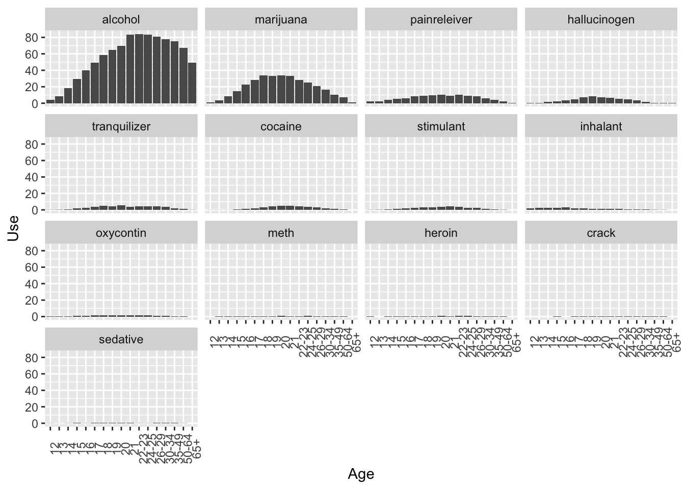
3. Now it’s your turn
Task A
Inspect the police_locals dataset. Here is the article
attached to it: https://fivethirtyeight.com/features/most-police-dont-live-in-the-cities-they-serve/.
Create a new dataset, called
police_locals_new, made of the following columns:city,force_size,ethnic_group,perc_locals. You should create theethnic_groupcolumn using a pivot function, as shown in this wpa or in wpa_4. The values in this column should beall,white,non_white,black,hispanic,asian. Theperc_localscolumn should contain the percentage of officers that live in the town where they work, corresponding to their ethnic group. Rearrange based on theethnic_groupand inspect it by printing the first 10 lines.Make a boxplot, with
ethnic_groupon the x-axis andperc_localson the y-axis.ethnic_groupshould be ordered from the lowestperc_localsto the highest. Put appropriate labels.
# these are the solutions for A2, as we will cover plotting later in the seminar
ggplot(data = police_locals_new, mapping = aes(x = reorder(ethnic_group, perc_locals), y = perc_locals)) +
    geom_boxplot() +
    labs(x = 'Ethnic group', y = 'Mean Percentage Locals') +
    theme(axis.text.x = element_text(angle = 90))
Task B
Inspect the unisex_names dataset. Here is the article
attached to it: https://fivethirtyeight.com/features/there-are-922-unisex-names-in-america-is-yours-one-of-them/.
Create a new dataset, called
unisex_names_new, made of the following columns:name,total,gap,gender,share. Thegendercolumn should only contain the values “male” and “female”. Thesharecolumn should contain the percentages.Multiply the
sharecolumn by 100. Re-arrange so that the first rows contain the names with the highesttotal. Print the first 10 rows of the newly created dataset. Create now a new dataset, calledunisex_names_common, with the names inunisex_names_newthat have a total higher than 50000.Using
unisex_names_common, make a barplot that hasshareon the y-axis,nameon the x-axis, and with each bar split vertically by color based on thegender.
# these are the solutions for B3, as we will cover plotting later in the seminar
ggplot(data = unisex_names_common, mapping = aes(x = name, y = share, fill = gender)) +
    geom_col() +
    labs(x = 'Name', y = 'Share', fill='Gender') +
    theme(axis.text.x = element_text(angle = 90))
Task C
Inspect the tv_states dataset. Here is the article
attached to it: https://fivethirtyeight.com/features/the-media-really-started-paying-attention-to-puerto-rico-when-trump-did/.
Create a new dataset, with a different name, that is the long version of
tv_states. You should decide how to call the new columns, as well as which columns should be used for the transformation.With the newly created dataset, make a plot of your choosing to illustrate the information contained in this dataset. As an inspiration, you can have a look at what plot was done in the article above.
# these are the solutions for C2, as we will cover plotting later in the seminar
ggplot(data = tv_states_new, mapping = aes(x = date, y= share_of_sentences, fill = state)) +
    geom_col() +
    labs(x = 'Date', fill = 'State', y= 'Share of sentences')

ggplot(tv_states_new, aes(x=date, y=share_of_sentences, group=state, color=state)) +
    geom_line() +
    labs(x = 'Date', y = 'News coverage (%)', color='Area') +
    scale_color_manual(values=c("#54F708", "blue", "red")) +
    theme(axis.text.x = element_text(angle = 90, size = 6))
Submit your assignment
Save and email your script to me at laura.fontanesi@unibas.ch by the end of Friday.